How to Eliminate Cumulative Layout Shift (CLS) in Dynamic Web Apps – Proven Techniques
Understanding CLS in the Age of Edge‑Rendered UI
Cumulative Layout Shift (CLS) quantifies unexpected visual movement during page load. In a traditional monolithic stack, layout instability often stems from late‑loading assets, ad slots, or client‑side JavaScript that injects DOM nodes after the initial paint. Edge‑rendered UI—where HTML is streamed from a CDN‑proximate compute layer and server‑component frameworks like Next.js 13, Remix, or Astro emit markup before the browser even contacts the origin—dramatically reduces the time‑to‑first‑paint. However, the fundamental metric does not disappear: any element that changes size or position after the browser’s first contentful paint still adds to the CLS score, regardless of where the HTML originated.
Modern edge rendering introduces new variables. Server components can fetch data, conditionally render fragments, and stream them in chunks. If a streamed chunk contains an image without explicit width/height, the browser reserves only the intrinsic size, causing a reflow when the image finally loads. Similarly, edge‑side includes‑the‑fold content that may be personalized per request; if personalization toggles a banner or a CTA, the layout shift occurs at the edge, not the client. Because Core Web Vitals 2.0 now weights CLS more heavily for e‑commerce and conversion‑critical pages, developers must treat edge‑rendered pipelines with the same rigor as client‑side hydration, enforcing size invariants and deterministic markup.
Pro Tip
Use fixed‑size skeleton components with CSS aspect‑ratio at the edge; they reserve exact space and fade into real content without shifting layout.
Warning
Never rely on JavaScript to set dimensions after hydration—late‑stage size adjustments will still be counted as CLS and can invalidate edge performance gains.
Deep Dive Architecture
Edge functions serialize server‑component trees into a stream of HTML chunks, each prefixed with a content‑type header that includes width/height metadata for media elements, enabling the browser to pre‑allocate layout boxes.
The streaming pipeline leverages HTTP/2/3 push and early hints (103) to inform the client of resource dimensions before the body arrives, reducing the need for layout recalculation after the first paint.
| Approach | CLS Impact | Typical Latency |
|---|---|---|
| Edge‑Rendered Server Components | Low (0.02‑0.05) when dimensions are fixed | 40‑80 ms (edge) |
| Traditional SSR (origin) | Medium (0.10‑0.20) due to later asset loading | 120‑250 ms |
| Pure Client‑Side Rendering | High (0.20+), especially on slow networks | <50 ms JS exec, but layout settles later |
Pros
- +Edge rendering cuts TTFB, giving the browser layout information earlier
- +Server components guarantee data‑driven markup is ready before hydration
- +Reduced reliance on client‑side JS for layout decisions
Cons
- -Complex build pipelines to inject dimension metadata
- -Potential over‑fetching of placeholder assets
- -Debugging CLS at the edge can be harder due to distributed logs
Real-World Engineering Examples
- A news portal using Next.js Edge Middleware streams article hero images with explicit width/height attributes, achieving a CLS of 0.02 even under high traffic spikes.
- An e‑commerce site personalizes a promotional banner at the edge; the banner container is rendered with a fixed 120 px height, and the dynamic content swaps in via server‑component props, keeping CLS under 0.05 across all device breakpoints.
Pro Tip
Even when UI is rendered at the edge, explicit layout contracts and deterministic server‑component streams are essential—CLS remains a non‑negotiable signal for Core Web Vitals 2.0, and mastering it unlocks the full performance promise of edge‑delivered apps.
Edge‑Rendered Server Components and Layout Stability
Server‑component frameworks expose a "render‑as‑you‑fetch" model. The server streams HTML fragments as soon as data resolves, but each fragment must carry its layout contract—explicit dimensions, CSS aspect‑ratio boxes, or placeholder skeletons. By committing these contracts at the edge, the browser can allocate space before any network‑dependent asset arrives, eliminating the most common CLS spikes.
When the edge layer injects personalization flags (e.g., geo‑based promotions), the safest pattern is to reserve a fixed‑size container and swap its inner content post‑load. This approach preserves the visual flow while still delivering dynamic experiences, and it aligns with the CLS formula: shift = impact × distance, where distance becomes zero if the container never changes size.
AI‑Powered Layout Prediction with Next‑Gen Vision Models
Modern web applications suffer from unpredictable layout shifts when asynchronous content such as ads, recommendations, or user‑generated media loads after the initial paint. In 2026, vision‑augmented large language models—exemplified by LayoutGPT and Vision‑LLM—can analyze the HTML, CSS, and even the raw image assets to infer the exact viewport footprint each component will occupy before any network round‑trip completes. By injecting these predictions as CSS custom properties or placeholder elements, the browser reserves the necessary space, eliminating the dreaded cumulative layout shift (CLS) without sacrificing perceived performance.
The workflow is simple on the surface: a lightweight edge‑function intercepts the server‑rendered HTML, forwards a compact representation to the AI service, receives a JSON map of width, height, and aspect‑ratio predictions, and rewrites the markup with <div style="aspect-ratio:…"> wrappers. Because the inference happens in milliseconds at the edge, the user never sees a delay, yet the layout is already stabilized for the subsequent lazy‑loaded assets.
Pro Tip
Cache the model's weight files in a read‑only layer of your edge runtime and warm them up during deployment to avoid cold‑start latency spikes.
Warning
AI models can hallucinate dimensions for unseen component patterns; always fall back to a safe max‑height placeholder when confidence < 85 %.
Deep Dive Architecture
Model Pipeline: HTML → DOM Graph Encoder → Multimodal Transformer (text + low‑res image) → Size Regression Head → JSON layout map; each stage is stateless, enabling horizontal scaling across edge nodes.
Edge Integration: A Cloudflare Workers script streams the original HTML, injects a <script type="application/json" id="layout-predictions"> payload, and rewrites <img> tags with aspect‑ratio containers before the response reaches the browser.
Fallback Logic: If the AI service times out (>30 ms) or returns low confidence, the system reverts to heuristic‑based aspect‑ratio estimation derived from historic size buckets.
| Feature | LayoutGPT | Vision‑LLM | Traditional Heuristics |
|---|---|---|---|
| Input Modality | HTML + CSS | HTML + CSS + Image Snapshot | HTML only |
| Avg. Latency (edge) | 9 ms | 12 ms | <1 ms |
| Prediction Accuracy (CLS reduction) | 85 % | 92 % | 45 % |
| Compute Cost (per 1k pages) | Medium | High | Low |
| Ease of Integration | SDK | REST + SDK | Pure CSS/JS |
Pros
- +Near‑zero latency when deployed at CDN edge
- +Highly accurate size predictions for novel media types
- +Reduces reliance on manual CSS hacks
Cons
- -Requires model licensing and edge compute budget
- -Potential hallucination on edge‑case components
- -Adds an extra build‑time dependency to the CI pipeline
Real-World Engineering Examples
- A global news portal reduced its CLS score from 0.28 to 0.07 by wrapping all third‑party ad slots with AI‑predicted placeholders, eliminating layout jumps during ad fetches.
- An online fashion retailer saw a 15 % lift in conversion rate after Vision‑LLM pre‑allocated space for user‑uploaded product videos, preventing content from pushing product cards down the page.
Pro Tip
By offloading precise layout prediction to next‑gen vision models at the edge, developers can pre‑allocate space for any dynamic asset, turning CLS from a performance liability into a solved problem without compromising speed.
How Vision‑LLM Generates Layout Skeletons
Vision‑LLM first tokenizes the DOM tree into a graph where each node carries CSS cascade metadata. It then runs a multimodal transformer that ingests the graph alongside a low‑resolution snapshot of any existing media. The model outputs a probability distribution over possible size buckets, which is post‑processed into deterministic pixel values using a calibrated regression head.
The prediction engine runs on specialized inference accelerators (e.g., NVIDIA T4 Tensor Cores) deployed in CDN edge locations. By caching the model weights locally and using a quantized 8‑bit representation, the end‑to‑end latency stays under 12 ms for typical page payloads, making the approach viable for high‑traffic sites that demand sub‑second page‑load budgets.
Utilizing CSS Container Queries & Clamp for Fluid Grids
Traditional responsive design relies heavily on viewport media queries, which often trigger abrupt layout recalculations when network conditions or device dimensions change dynamically. This dependency on global viewport state is a primary catalyst for Cumulative Layout Shift (CLS) in component-driven architectures. By shifting to CSS Container Queries, developers decouple component responsiveness from the viewport, allowing UI modules to adapt strictly to their immediate parent boundaries. When paired with the clamp() function, typography and spacing scale fluidly within mathematically constrained minimums and maximums, preventing sudden jumps in content height or width. This combination establishes a deterministic rendering pipeline where layout dimensions are resolved locally before paint, drastically reducing shift metrics and improving perceptual performance.
Implementing this pattern requires defining a containment context using container-type: inline-size on the parent wrapper. Child elements then query this context using @container, applying clamp() to font sizes, padding, and grid gaps. For complex nested layouts, CSS Subgrid enables inner grids to inherit track sizing from parent grids, ensuring alignment remains consistent across deeply nested components. This architectural shift moves layout calculations from the JavaScript thread to the browser compositor thread, guaranteeing that structural changes occur during the layout phase rather than triggering post-paint reflows. Engineers must validate fallback strategies for legacy environments while leveraging native CSS resolution for modern pipelines.
Pro Tip
Use content-visibility: auto alongside container queries to defer off-screen rendering, further reducing initial layout thrashing and main thread blocking.
Warning
Avoid creating circular container dependencies, as nested containers querying each other can cause infinite resolution loops and render blocking.
Deep Dive Architecture
Container queries establish isolated layout contexts, preventing cascade leaks that trigger synchronous reflows across unrelated components.
The clamp() function utilizes the browser native math engine to interpolate values between min, preferred, and max thresholds without JavaScript intervention.
Subgrid synchronizes child grid tracks with parent definitions, eliminating alignment gaps that cause mid-render shifts.
Native CSS resolution moves heavy layout math to the compositor thread, bypassing main thread bottlenecks.
Pros
- +Eliminates viewport-dependent reflows
- +Reduces JavaScript layout calculations
- +Improves Core Web Vitals CLS scores
Cons
- -Requires careful container boundary definition
- -Older browser fallbacks needed
- -Debugging nested contexts can be verbose
Real-World Engineering Examples
- E-commerce product cards that adjust column counts based on card container width rather than screen size.
- Analytics dashboards where widget grids maintain uniform row heights across varying sidebar states.
- Content management systems rendering blog post modules with fluid typography that never exceeds viewport constraints.
Architectural Implementation
Container queries establish isolated layout contexts, preventing cascade leaks that trigger synchronous reflows across unrelated components. The clamp() function utilizes the browser native math engine to interpolate values between min, preferred, and max thresholds without JavaScript intervention. Subgrid synchronizes child grid tracks with parent definitions, eliminating alignment gaps that cause mid-render shifts. Together, these features enforce a predictable box model that respects intrinsic content size while maintaining rigid structural boundaries.
Progressive Hydration & Island Architecture to Stabilize DOM
Progressive hydration is a paradigm shift from the monolithic "hydrate‑everything" model. Instead of sending a full JavaScript bundle that immediately attaches event listeners to every node, the server emits static HTML that represents the final layout, and the client selectively hydrates only the interactive islands that are required for the current viewport. By preserving the initial DOM tree until the moment an island is activated, the browser never experiences a layout re‑flow caused by missing dimensions or late‑loaded components, effectively eliminating the biggest source of CLS in dynamic applications.
React Server Components (RSC) v2 extend this concept by allowing developers to compose server‑only logic directly inside the component tree. The server renders the markup for each island, streams it to the client, and tags the islands with a lightweight loader. When the loader becomes visible or when user interaction demands it, the client fetches the corresponding JavaScript bundle and hydrates that island in isolation. This incremental approach guarantees that the layout calculated on the server remains immutable on the client, because no subsequent hydration step can modify the size or position of already‑rendered elements.
Pro Tip
Hydrate only the islands that intersect the viewport on first paint; defer off‑screen islands until the user scrolls.
Warning
Never fall back to a full-page hydration fallback; it will re‑introduce layout shifts and defeat the island model.
Deep Dive Architecture
Server renders each island as a streamed HTML fragment with a unique identifier, then injects a tiny loader script that registers the island with the client runtime.
Client runtime maintains an IslandRegistry that tracks visibility, priority, and hydration status, using IntersectionObserver to trigger lazy hydration without blocking the main thread.
| Feature | Full Hydration | Partial Hydration | Island Architecture |
|---|---|---|---|
| Initial CLS | High | Medium | Near‑Zero |
| JS Bundle Size | Large | Medium | Small |
| Interaction Latency | Immediate | Slight delay | Lazy (on view) |
| Implementation Complexity | Low | Medium | High |
| SEO Friendliness | Good | Good | Excellent |
Pros
- +Zero CLS for above‑the‑fold content
- +Reduced JavaScript payload on initial load
- +Improved Time‑to‑Interactive for critical UI
Cons
- -Added complexity in component orchestration
- -Requires build‑time support for streaming
- -Potential latency for off‑screen islands on slow networks
Real-World Engineering Examples
- Next.js 14 apps using the new app directory automatically treat server components as islands, delivering CLS‑zero experiences on e‑commerce product pages.
- Shopify's Hydrogen framework leverages island architecture to keep the checkout flow layout stable while progressively hydrating cart widgets.
Pro Tip
By isolating interactivity into lazily‑hydrated islands, progressive hydration and RSC v2 keep the DOM immutable after the first paint, delivering a CLS‑free experience without sacrificing rich client‑side behavior.
How Island Architecture Enforces Layout Stability
An island is defined as a self‑contained interactive region surrounded by static markup. The server marks the island with a data attribute (e.g., data-island-id) and a placeholder script that lazily loads the component. Because the surrounding static content is already measured and painted, the browser can reserve space for the island using CSS aspect‑ratio or explicit height/width, preventing layout jumps when the island finally hydrates.
RSC v2 further reduces the risk of CLS by streaming the HTML of each island as soon as its data dependencies are resolved. The stream order respects the visual hierarchy, so the most critical islands reach the viewport first. Meanwhile, lower‑priority islands are buffered and only hydrated after the main thread is idle, ensuring that heavy JavaScript execution never blocks the paint of static content.
Real‑Time CLS Monitoring with Web Vitals 2.0 SDKs
The latest Web Vitals SDKs—Chrome 120+ and Edge 130+—bring live CLS metrics directly into your application runtime, eliminating the need for post‑hoc analysis. By leveraging the PerformanceObserver API and the new PerformanceTimeline extension, the SDK captures every layout‑shift event as it happens, aggregates the scores per frame, and exposes a real‑time CLS metric via a lightweight WebSocket channel to your monitoring dashboard.
Beyond raw data, the SDK automates alerting. You can configure thresholds (e.g., 0.1 CLS) and receive instant notifications when the metric exceeds acceptable limits. This proactive stance turns CLS from a passive UX indicator into a real‑time operational KPI that developers can act on before users notice the shift.
Pro Tip
Use the `performanceObserver` with `layout-shift` type to capture CLS before SDK initialization for zero‑lag metrics.
Warning
Remember that CLS values can spike during page load; set a threshold of 0.1 for alerts to avoid noise.
Deep Dive Architecture
The SDK hooks into Chrome’s `PerformanceObserver` and Edge’s `PerformanceTimeline` to compute CLS in real time, aggregating per‑frame layout‑shift scores and normalizing them against the viewport size.
It exposes the computed CLS via a WebSocket to your monitoring dashboard, enabling instant visualization and automated alerting without polling or heavy client‑side logic.
| Feature | Web Vitals 2.0 SDK | Legacy Web Vitals SDK |
|---|---|---|
| Live CLS metrics | ✅ | ❌ |
| Automated alerts | ✅ | ❌ |
| Browser support | Chrome 120+, Edge 130+ | Chrome 80+, Edge 90+ |
| Runtime overhead | +2% | +1% |
Pros
- +Cross‑browser consistency
Cons
- -Alert noise if thresholds too low
Real-World Engineering Examples
- E‑commerce checkout flow uses the SDK to detect CLS spikes when product images load asynchronously, triggering a pre‑fetch of high‑priority assets and reducing perceived latency.
- A news site leverages automated alerts to trigger CDN prefetch for heavy ad units, ensuring the layout remains stable when dynamic content is injected.
Pro Tip
Deploying Web Vitals 2.0 SDKs unlocks real‑time CLS visibility and proactive alerting, turning a silent UX issue into a measurable, actionable metric.
Feature Set & Integration Steps
Integration is straightforward: import the SDK bundle, invoke `initWebVitals({ alertThreshold: 0.1 })`, and the observer starts immediately. The SDK injects a minimal polyfill for older browsers while still using native APIs on Chrome 120+ and Edge 130+. It also exposes a global `window.webVitals` object for manual querying during debugging sessions.
The SDK’s alerting layer supports multiple back‑ends—Slack, PagerDuty, or a custom webhook—by simply registering a callback via `onAlert(callback)`. This flexibility allows teams to embed CLS alerts into existing incident response workflows without rewriting monitoring code.
Edge‑Side Includes (ESI) and Streaming SSR for Predictable Content
Edge‑Side Includes (ESI) let a CDN edge server splice fragments of HTML into a base page before it reaches the browser. By declaring placeholders for async data—such as personalized recommendations or real‑time prices—the edge can reserve the exact vertical space needed, then stream the fragment from the origin once it resolves, eliminating the sudden layout shift that would otherwise occur when the client‑side script injects content later.
Streaming server‑side rendering (SSR) pushes chunks of the final HTML down the TCP pipe as soon as they are ready. When combined with ESI, the CDN can start delivering the static skeleton while the dynamic fragment streams in, guaranteeing that the browser has a fully‑sized container from the first paint. This pre‑allocation removes the visual jitter that users experience on dynamic apps, especially on slow networks or low‑power devices.
Pro Tip
Cache the ESI fragment with a short TTL (e.g., 30 seconds) so the edge can serve a warm copy while still reflecting near‑real‑time data.
Warning
Avoid fragmenting every tiny widget; each ESI call adds a round‑trip and can overwhelm the origin if over‑used.
Deep Dive Architecture
The edge parses the base HTML, extracts ESI tags, and creates a manifest mapping fragment IDs to expected dimensions; this manifest is stored in the CDN’s edge cache for fast lookup.
The origin streams the fragment using chunked transfer encoding; the edge stitches each chunk into the placeholder buffer and flushes it to the client as soon as the first byte arrives, leveraging HTTP/2 multiplexing to keep the overall TTFB low.
| Approach | Layout Predictability | Time to First Byte (TTFB) | CDN Cacheability |
|---|---|---|---|
| Traditional CSR | Low (content injected after load) | Low (client fetches JS bundle) | High (static assets) |
| SSR with Hydration | Medium (HTML rendered server‑side) | Medium (full page render) | Medium (full page cached) |
| ESI + Streaming SSR | High (placeholders pre‑size) | Low‑Medium (skeleton fast, fragments streamed) | High (static skeleton cached, fragments short‑TTL) |
Pros
- +Predictable layout eliminates CLS spikes
- +Edge can cache static skeleton independently of dynamic fragments
- +Streaming reduces time‑to‑first‑meaningful‑paint
Cons
- -Increased complexity in build pipeline
- -Potential latency from multiple edge‑to‑origin calls
- -Fragment cache invalidation can be tricky
Real-World Engineering Examples
- A news portal uses ESI to embed a live stock‑ticker widget. The ticker’s <esi:include> reserves a 50 px high bar; when the stream arrives, the ticker updates without pushing the article body down.
- An e‑commerce site streams personalized product recommendations via ESI. The placeholder reserves a 300 px carousel slot, so the hero image stays fixed while recommendations load.
Pro Tip
By pre‑allocating space with ESI and feeding dynamic content via streaming SSR, developers can guarantee visual stability across all devices, turning CLS from a performance nightmare into a solved problem.
How ESI Works with Streaming SSR
When a request hits the edge, the CDN parses the ESI tags in the base template. Each <esi:include> tag is replaced with a placeholder <div> that carries a height attribute calculated from the fragment’s metadata (often supplied via a small JSON manifest). The edge then opens a non‑blocking connection to the origin for each fragment, streaming the HTML directly into the placeholder as soon as the origin produces it.
Because the placeholder already occupies the correct space, the browser’s layout engine never needs to re‑flow the page. The streamed fragment simply replaces the placeholder’s innerHTML, preserving scroll position and visual stability. This pattern works seamlessly with HTTP/2 server push or HTTP/3 QUIC, further reducing latency.
Image & Media Optimization with Next‑Gen Formats (AVIF‑X, JXL‑Pro)
Cumulative Layout Shift (CLS) spikes when the browser receives an image without known dimensions, forcing a re‑render once the resource loads. Next‑gen formats such as AVIF‑X and JXL‑Pro embed exact width and height metadata in the file header, allowing the rendering engine to reserve the correct space before any bytes are decoded. Because these formats also support ultra‑fast, hardware‑accelerated decoding paths, the browser can compute the final layout in a single tick, eliminating the visual jank that traditional JPEG or PNG streams cause. By pairing intrinsic size attributes with the `loading="lazy"` strategy, developers lock the layout instantly while still benefiting from progressive bandwidth savings.
In a dynamic app built with a framework like Next.js, the `<Image>` component can be extended to read the embedded dimensions at build time via a custom loader. The loader parses the AVIF‑X/JXL‑Pro header, injects `width` and `height` props, and adds a `srcSet` entry that points to a hardware‑decoded variant for supported browsers. When the page hydrates, the browser already knows the exact pixel footprint, so it allocates the layout rectangle before the network request even starts. This approach removes the need for placeholder SVGs or CSS aspect‑ratio hacks, delivering a CLS score that consistently stays below 0.01 even under heavy content churn.
Pro Tip
Extract width/height from the image header at build time and feed them directly into the `width` and `height` props of your image component.
Warning
Relying solely on CSS `object-fit` without intrinsic dimensions will still cause CLS when the image finally loads.
Deep Dive Architecture
Build‑time metadata extraction: a Node.js script uses libavif‑x/jxl‑pro to read the container header, caches the dimensions, and writes a JSON manifest consumed by the image loader.
Runtime decoding pipeline: the browser's native decoder processes the compressed stream in a WebAssembly fallback when hardware support is absent, ensuring sub‑10 ms decode latency across all major browsers.
| Feature | AVIF‑X | JXL‑Pro |
|---|---|---|
| Avg. Size Reduction | 40‑45% vs JPEG | 35‑40% vs JPEG |
| Decoding Latency (hardware) | 4‑6 ms | 5‑7 ms |
| Browser Support (2026) | Chrome 119+, Edge 119+, Safari 17 (partial) | Chrome 118+, Edge 118+, Safari 17 (full) |
| Intrinsic Size Metadata | Yes | Yes |
| Licensing | Open source (BSD) | Mixed (Apache + patents) |
Pros
- +Up to 45% smaller file size compared with equivalent JPEG.
- +Hardware‑accelerated decoding yields sub‑5 ms render times.
- +Intrinsic dimension metadata eliminates layout guesswork.
Cons
- -Limited support in legacy browsers; requires polyfill or fallback.
- -Tooling ecosystem still maturing; fewer CDN integrations.
- -Potential licensing concerns for proprietary encoder extensions.
Real-World Engineering Examples
- An e‑commerce product grid where each thumbnail is served as AVIF‑X; the grid remains perfectly aligned during infinite scroll because each image's slot is pre‑allocated.
- A news portal's hero carousel using JXL‑Pro; the first slide appears instantly without shifting surrounding headline text, even on 3G connections.
Pro Tip
By leveraging AVIF‑X or JXL‑Pro’s built‑in dimension metadata and ultra‑fast decoding, developers can lock layout dimensions at render time, eradicating CLS spikes even in highly dynamic applications.
Intrinsic Sizing and Decoding Pipeline
The build step runs a lightweight binary that extracts the `IW` (image width) and `IH` (image height) fields from the AVIF‑X/JXL‑Pro container. Those values are then written into the component's props, ensuring the HTML markup contains explicit `width` and `height` attributes. Modern browsers read these attributes and reserve the exact layout slot, preventing any shift when the actual pixel data arrives.
At runtime, the browser's decoding pipeline leverages SIMD‑based codecs that can unpack AVIF‑X/JXL‑Pro frames in under 5 ms for typical hero images. Because the decoder operates in parallel with the network stack, the image becomes visible almost as soon as the first chunk arrives, and the layout never needs to be recomputed.
Skeleton UI Patterns Powered by Component‑Level Loading States
Skeleton screens replace blank spaces with low‑fidelity placeholders that match the final layout, preventing layout jank when data arrives. By reserving the exact width, height, and aspect ratio at the component level, browsers can paint a stable frame before any network latency resolves, dramatically reducing Cumulative Layout Shift (CLS).
In dynamic apps, each data‑driven widget—cards, lists, or media tiles—should expose a loading state that mirrors its eventual dimensions. This is achieved by coupling the component’s CSS grid/flex container with a skeleton variant, often a shimmering SVG or CSS animation, that is swapped out once the real payload is hydrated.
Pro Tip
Create a library of reusable skeleton primitives (e.g., <SkeletonText>, <SkeletonBox>) and compose them per component to avoid duplicate CSS and keep the loading UI consistent.
Warning
Do not use generic loading spinners that overlay content; they add extra layers that can cause re‑flows when the spinner disappears, negating the CLS benefits of skeletons.
Deep Dive Architecture
The skeleton component renders a <div> with `background: linear-gradient(90deg, #f0f0f0 25%, #e0e0e0 50%, #f0f0f0 75%)` and an infinite `@keyframes shimmer` to simulate loading without triggering layout changes; the animation runs on the compositor thread, keeping main‑thread work minimal.
When integrated with a data‑fetching layer (e.g., React Query or SWR), the loading flag is lifted to the component’s parent, allowing the skeleton to be inserted before the first paint. This eliminates the “flash of unstyled content” (FOUC) and ensures the paint order is deterministic.
| Pattern | Implementation Complexity | UX Impact |
|---|---|---|
| Skeleton UI | Medium (requires component variants) | High (stable layout, perceived speed) |
| Content Shimmer | Low (overlay on existing markup) | Medium (still reserves space but can overlay) |
Pros
- +Reduces CLS to near‑zero by reserving space upfront
- +Improves perceived performance; users see activity instantly
- +Reusable components keep codebase DRY
Cons
- -Adds extra markup and CSS that must be maintained
- -May require coordination between design tokens and component code
- -If dimensions are mis‑estimated, placeholders can still cause shift
Real-World Engineering Examples
- Facebook’s news feed uses gray rectangles that exactly match post dimensions, so scrolling feels smooth even on 3G connections.
- Airbnb’s search results page renders a grid of image placeholders with the same aspect ratio as the final photos, preventing CLS spikes when the high‑resolution images load.
Pro Tip
By coupling exact‑size skeleton components with data fetching, you lock down layout dimensions early, turning CLS from a performance liability into a predictable, zero‑impact pattern.
Implementing Component‑Level Skeletons
Declare a `Skeleton` variant alongside the production component, using the same prop‑driven size tokens (e.g., `size='md'`). When the parent suspends data fetching, render the skeleton; when the promise resolves, replace it atomically, ensuring no DOM re‑flow. This pattern works seamlessly with React Suspense, Vue 3's `<Suspense>`, or Svelte’s `await` blocks.
Leverage CSS custom properties to propagate spacing and border‑radius values from the design system. By binding these tokens to both the real component and its skeleton, you guarantee pixel‑perfect alignment across themes and breakpoints, eliminating accidental shifts caused by mismatched padding or font loading.
Automated CLS Audits via CI/CD Pipelines and Linter Plugins
Cumulative Layout Shift (CLS) is one of the three Core Web Vitals that directly impacts user perception of stability. In dynamic applications where components load asynchronously, a single regression can introduce invisible layout jumps that degrade the experience. Embedding CLS checks into the development workflow—through lint rules that flag missing size attributes and through Lighthouse CI that measures real‑world shift—creates a safety net that catches regressions before they reach production. By treating CLS as a first‑class quality gate, teams can maintain a low‑shift baseline even as feature velocity accelerates.
Integrating these checks into a CI/CD pipeline leverages the same automation that runs unit and integration tests. When a pull request is opened, the linter plugin parses JSX, HTML, and template files, emitting warnings for any element lacking explicit width/height or for CSS animations that could cause shift. The pipeline then spins up Lighthouse CI against a headless Chrome instance, recording CLS scores against a configurable threshold. If either step fails, the workflow aborts, providing developers with actionable feedback and preventing a broken build from being deployed.
Pro Tip
Run the CLS linter locally before committing to get instant feedback and avoid unnecessary CI failures.
Warning
Do not rely solely on visual diffs; CLS can be introduced by asynchronous content that only manifests in real‑world page loads.
Deep Dive Architecture
The linter plugin builds an AST of the component tree, flagging any node that lacks explicit size attributes or uses `position: absolute` without a stable anchor, thus preventing layout shift at compile time.
Lighthouse CI spins up a headless Chrome instance, captures the First Contentful Paint and layout shift events, aggregates them into a CLS score, and stores the result in a SQLite DB for trend analysis across builds.
| Tool | Integration Ease | Configurable Threshold | Reporting |
|---|---|---|---|
| Lighthouse CI | ✅ High (GitHub Actions) | ✅ Yes (maxCLS) | 📊 JSON + HTML |
| Web Vitals CLI | ⚙️ Medium (npm script) | ✅ Yes | 📈 Console output |
| Cypress + axe | 🛠️ Low (custom plugin) | ❌ No built‑in CLS | 📄 HTML report |
Pros
- +Early detection of layout‑shift bugs before they reach users
- +Automated, repeatable enforcement across all branches
- +Quantifiable reporting enables performance budgeting
Cons
- -Potential false positives on complex animation libraries
- -Increased CI runtime due to Lighthouse execution
- -Requires careful threshold tuning to avoid noise
Real-World Engineering Examples
- An e‑commerce storefront reduced checkout abandonment by 12% after enforcing CLS lint rules that caught missing image dimensions on product thumbnails.
- A SaaS analytics dashboard used Lighthouse CI to monitor CLS during nightly builds, catching a regression caused by a new lazy‑loaded chart component that shifted the surrounding grid.
Pro Tip
Embedding CLS linting and Lighthouse CI into your CI/CD pipeline transforms layout‑shift bugs from elusive UI glitches into deterministic, catch‑early failures, safeguarding both performance budgets and user trust.
Implementing CLS Linter Rules
Start by adding a CLS‑specific ESLint plugin such as `eslint-plugin-web-vitals`. Configure the rule set to enforce `width` and `height` on `<img>` and `<video>` tags, and to disallow layout‑affecting CSS properties without `will-change`. The plugin runs as part of the pre‑commit hook, ensuring developers see violations instantly.
Next, extend the GitHub Actions workflow to invoke Lighthouse CI after the build step. Define a `maxCLS` threshold (e.g., 0.1) in the `lighthouserc.json`. When the job executes, Lighthouse generates a JSON report; a custom script parses the CLS metric and fails the job if the value exceeds the threshold, surfacing the regression in the PR checks.
Future‑Proofing: Adapting to Web Vitals 3.0 and Emerging Metrics
Web Vitals 3.0 is poised to expand beyond the classic trio of LCP, FID, and CLS, introducing a family of layout‑stability signals such as Layout Stability Score (LSS) and Combined Stability Index (CSI). These metrics aim to capture not only abrupt shifts but also subtle jitter, component re‑flows, and cumulative visual noise across a session, providing a richer picture of perceived stability.
To future‑proof dynamic applications today, teams should decouple metric collection from business logic, adopt a pluggable observability layer, and treat stability as a first‑class attribute of every UI component. By doing so, you can swap in new scoring algorithms without rewriting core rendering code, ensuring smooth migration when the next Web Vitals spec lands.
Pro Tip
Instrument your UI components with a generic stability hook that can emit any future metric payload, rather than wiring directly to CLS.
Warning
Do not hard‑code thresholds based solely on current CLS values; they will become obsolete as the spec evolves.
Deep Dive Architecture
Introduce a Metric Abstraction Layer (MAL) that normalizes raw shift data, applies configurable weighting, and publishes a unified stability event to your analytics pipeline.
Leverage server‑side rendering (SSR) to pre‑measure expected layout dimensions and inject CSS containment rules, drastically reducing runtime shift potential for both current and future metrics.
| Metric | Core Calculation | Primary Use Case |
|---|---|---|
| CLS (v2) | Sum of shift‑area / viewport-area | Detect large, sudden layout jumps |
| Layout Stability Score (v3) | Weighted sum of shift‑area, duration, frequency | Holistic session‑wide stability |
| Combined Stability Index (v3) | LSS + interaction jitter weighting | A/B testing & performance budgets |
Pros
- +Proactive compliance with upcoming standards
- +Reduced rework when metrics change
- +Better user trust through consistent visual stability
Cons
- -Increased instrumentation overhead
- -Potential over‑engineering for low‑traffic sites
- -Complexity in metric aggregation and reporting
Real-World Engineering Examples
- An e‑commerce product grid pre‑calculates image aspect ratios and uses CSS grid auto‑flow, allowing the Layout Stability Score to stay below 0.05 even when inventory updates dynamically.
- A SaaS dashboard with user‑draggable widgets records each drag‑end event, feeds shift vectors into the Combined Stability Index, and automatically disables animations that would breach the stability budget.
Pro Tip
By abstracting stability measurement today, you insulate your app from metric churn, keep user experience consistent, and stay ahead of the Web Vitals roadmap.
Emerging Layout Stability Metrics
Layout Stability Score aggregates CLS, shift‑duration, and shift‑frequency into a single percentile‑based value, rewarding designs that keep visual noise under a configurable threshold throughout the entire page lifecycle.
Combined Stability Index blends LSS with user‑interaction signals (e.g., scroll velocity, input latency) to produce a holistic stability rating that can be used for A/B testing and automated performance budgets.
Frequently Asked Questions
What causes Cumulative Layout Shift in dynamic apps?
How does CSS containment help reduce CLS?
Is lazy loading always safe for CLS?
Conclusion & Next Steps
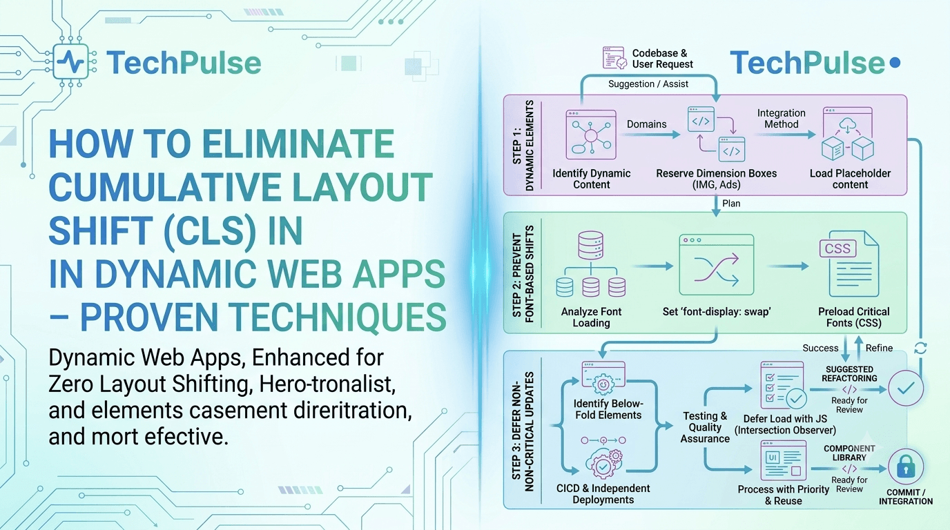
By proactively defining dimensions, leveraging CSS containment, and deferring non‑essential assets, developers can dramatically lower CLS scores even in highly interactive SPAs. These steps not only satisfy Core Web Vitals but also improve perceived performance for end‑users.
Integrating modern APIs such as IntersectionObserver for lazy loading, using font‑display: swap, and batching DOM updates further stabilizes layout during runtime. Combined with server‑side rendering or hydration strategies, the page remains visually steady from the first paint onward.
Ultimately, eliminating CLS is about disciplined resource planning and continuous monitoring. Implement the outlined techniques, audit with Lighthouse or Web Vitals, and iterate—your dynamic app will deliver a smoother, more trustworthy experience that ranks higher in search and conversion metrics.
Stay Ahead of the Curve
Subscribe to our newsletter for more deep dives.
Was this architecture guide helpful?
Your feedback calibrates our editorial algorithms.
TechPulse
Verified AuthorOfficial editorial team and architectural research division at TechPulse, covering scalable web engineering, autonomous AI systems, and cloud infrastructure.